Next-Generation Retail Logistics Analytics with Databricks AI / BI Dashboards
In modern retail logistics, speed and precision define success. Executives need real-time visibility into how reliably products move through their supply network — and where risks are emerging before they impact the customer.
We live in world where the latency of cognitive labor is a key differentiator in competitive retail markets.
The speed of your information transformation, from disparate raw sources, to information synthesized into decision-making form, is critical in the art of retail knowledge work.
In the retail landscape a major challenge is integrating legacy systems into a cohesive information view that can allow business leaders to make accurate decisions faster than the competition. To do that, retail leaders need to build reports and dashboards to synthesize information from the vast ocean of raw data we drown in today.
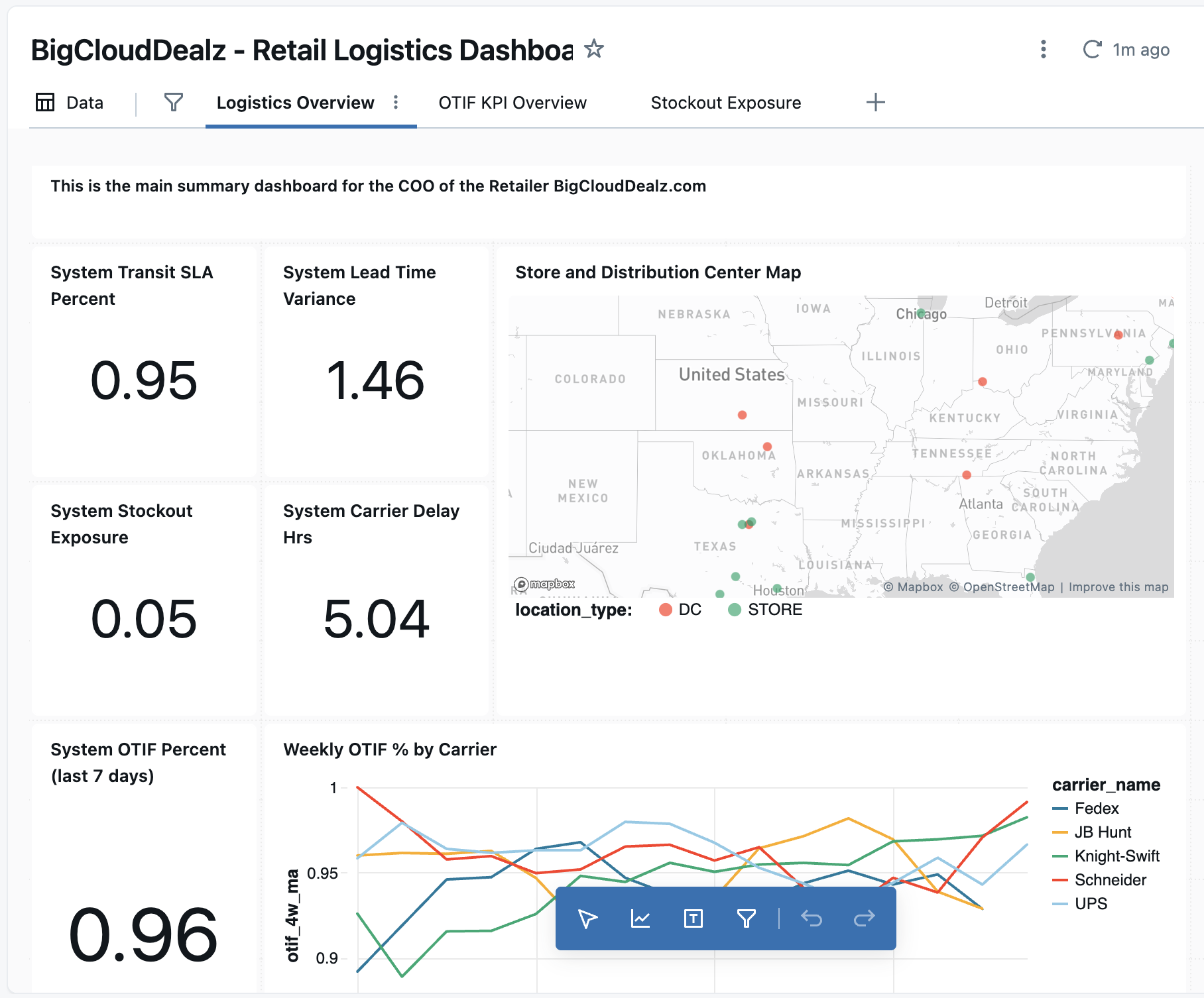
A Databricks AI / BI Dashboard built on the Medallion Data Architecture provides exactly that: a single, trusted view of operational health powered by governed data and intelligent analytics. By surfacing key performance indicators like On-Time In-Full (OTIF) through dynamic visualizations and natural-language insights, the dashboard transforms complex warehouse, carrier, and inventory data into actionable intelligence for the COO, logistics leads, and merchandising teams alike.
Visualizing the Retail Data Lakehouse
Databricks’ AI/BI Dashboards (formerly known as Lakeview Dashboards) represent the company’s native visualization layer within the Unity Catalog ecosystem. Unlike tools such as Power BI or Tableau, these dashboards are not meant to connect to external data sources or serve as a feature-rich BI platform.
Instead, their value lies in being tightly integrated with the Databricks Lakehouse, providing cost efficiency (no extra licenses), secure live connections to governed data, and accelerated dashboard creation through AI-assisted “text-to-chart” capabilities. This combination allows teams to quickly turn trusted, cataloged data into visual insights without leaving the Databricks environment.
While the product is now generally available, it’s still maturing. Current limitations include less flexibility in chart formatting and a developing user interface compared to established BI tools. However, Databricks’ roadmap suggests rapid progress—making these dashboards increasingly viable for mid-management and executive reporting within the next year. For organizations seeking leaner stacks and integrated reporting directly in their data platform, AI/BI Dashboards offer a strategic path forward without additional vendors or integration overhead.
For the remainder of this article, I'm going to show you how to build out two key visualization components on a retail logistics dashboard based on the OTIF metric view we developed in the last article.
Visually Implementing OTIF Analytics in Our Retail Dashboard
Here’s how we’ll put the new OTIF metric view to work on the dashboard. We're going to display:
- the 7-day average of the latest OTIF metric
- a line chart that shows a comparison of the OTIF by carrier over time
Given that we've done all of the hard work by defining the core data model in the metric views and the data lakehouse gives us the next-generation performance of the Spark engine, we can re-calculate metrics from raw data and give management decision-enabling information with low latency.
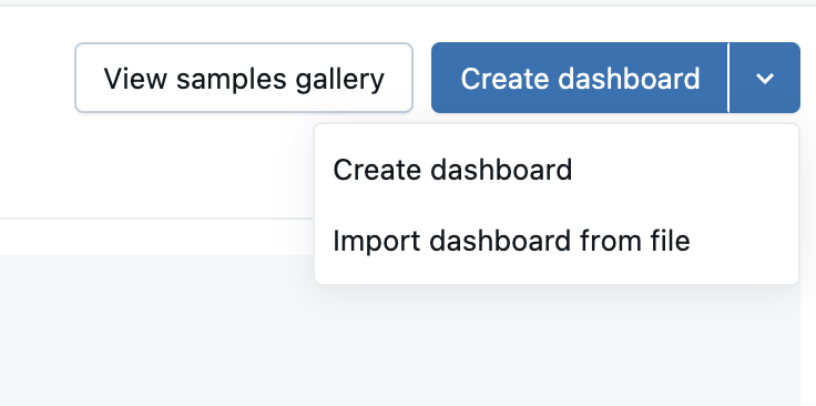
To get going navigate to the Dashboard section of your Databricks workspace and click on the "Create Dashboard" button in the upper right corner, as shown below.
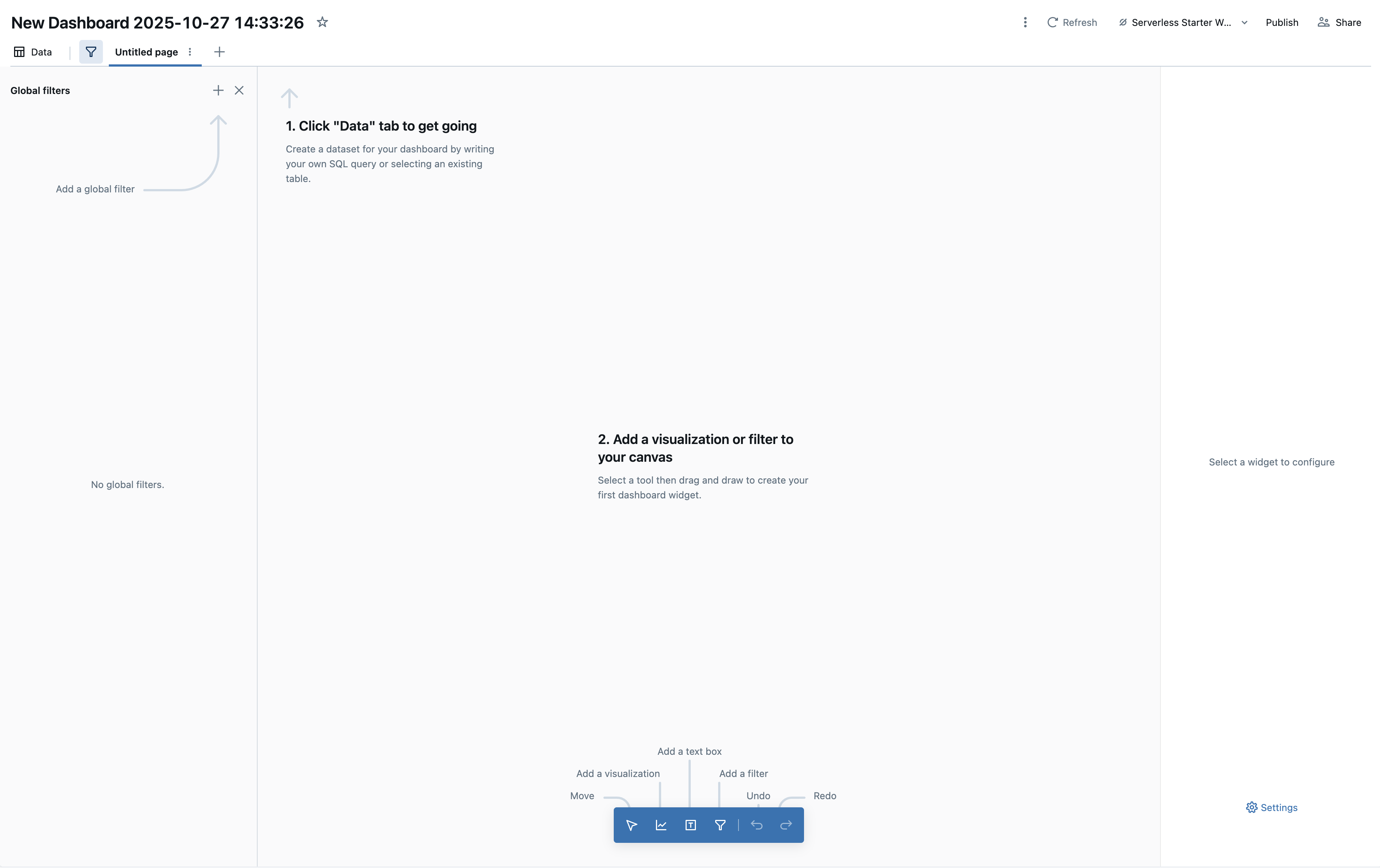
This should give you a new Dashboard canvas workspace as shown below.
Adding a Counter Visualization for Company-Wide OTIF
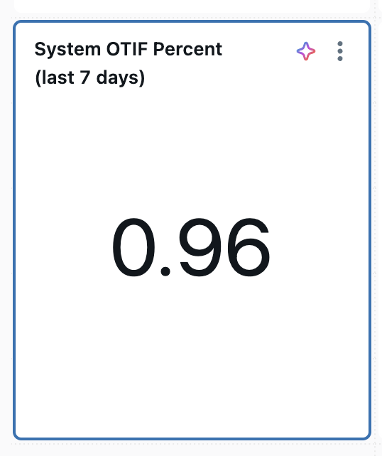
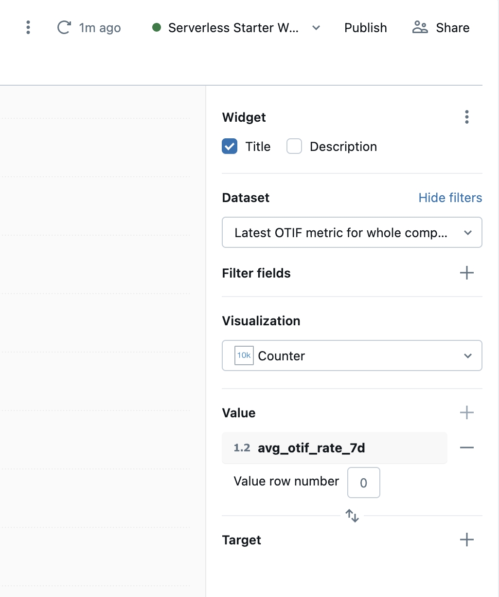
We'll start by adding a new "counter" visualization widget (read: it takes a calculation from the data lakehouse and puts it in a small box beside a label) to represent the company-wide OTIF metric, as seen below.
You do that by clicking on the "add visualization" button on the blue toolbar at the bottom of the workspace canvas. Drag that new counter-widget-thing around until you get it where you want it, and then look at the right-hand side panel. You should see a list of configuration options, as shown below.
Now you need some data from the ol' data lakehouse. The drop down for "dataset" at the top is empty currently, so we'll need to start bringing in information from our metric layer (because it has all the business logic already constructed there). To do that you will click on the "data"-button in the upper left-hand corner of the workspace, which will bring up a dialog shown below.
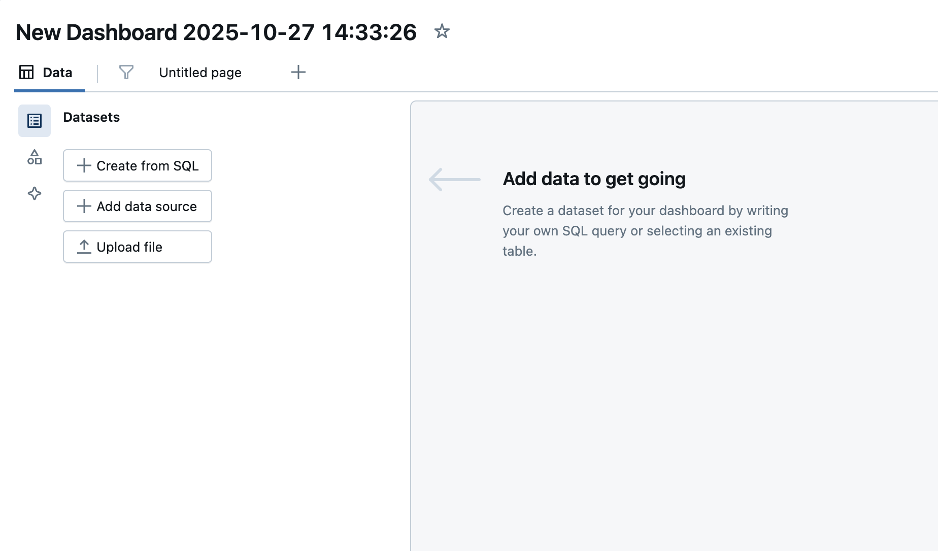
Click on the "Create from SQL" button under "Datasets" and add the SQL below in the right hand pane and test it with the "Run" button.
SELECT
  date,
  AVG(otif_rate) OVER (
    ORDER BY date
    ROWS BETWEEN 6 PRECEDING AND CURRENT ROW
  ) AS avg_otif_rate_7d
FROM view_otif_by_date
ORDER BY date DESC;
Once you've confirmed your metric-view query above runs successfully, save the dataset as "Latest OTIF for company" (or something similar). Now it should show up in the "data" drop down for the configuration of our OTIF widget. Select "counter" as the visualization and avg_otif_rate_7d as the value for counter widget. Once you go back to the preview area, you should see the metric view calculated OTIF value showing up in your dashboard.
Adding a Line Visualization for Deeper Comparison of Carrier's OTIF
Now that you know the process, let's add a mult-line visualization to do more complex analysis of how different Carrier's perform with respect to the OTIF metric. Go ahead and add another metric view-based dataset as defined by the SQL below.
-- OTIF by Carrier, last 13 weeks, with 4-week rolling average and top-6 carriers by volume
WITH weekly AS (
  SELECT
    week,
    carrier_name,
    MEASURE(otif_rate)        AS otif_pct,
    MEASURE(shipment_rows)    AS shipments
  FROM big_cloud_dealz_development.gold.metric_view_otif
  WHERE week >= DATE_TRUNC('week', CURRENT_DATE() - INTERVAL 13 WEEKS)
  GROUP BY week, carrier_name
),
top_carriers AS (
  SELECT
    carrier_name,
    SUM(shipments) AS total_shipments_13w,
    DENSE_RANK() OVER (ORDER BY SUM(shipments) DESC) AS rnk
  FROM weekly
  GROUP BY carrier_name
),
smoothed AS (
  SELECT
    w.week,
    w.carrier_name,
    w.otif_pct,
    AVG(w.otif_pct) OVER (
      PARTITION BY w.carrier_name
      ORDER BY w.week
      ROWS BETWEEN 3 PRECEDING AND CURRENT ROW
    ) AS otif_4w_ma
  FROM weekly w
  JOIN top_carriers t
    ON w.carrier_name = t.carrier_name
   AND t.rnk <= 6
)
SELECT *
FROM smoothed
ORDER BY week, carrier_name;
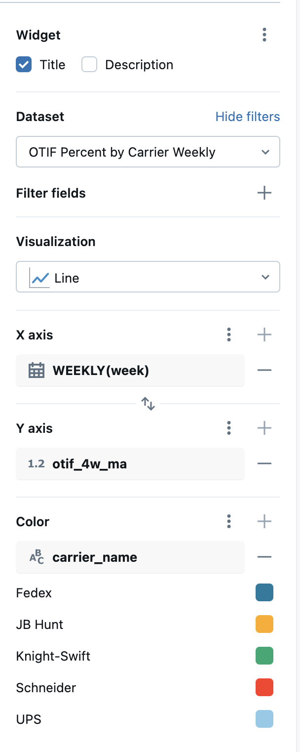
One the widget blue toolbar, select visualization and drag it onto the canvas. Select the dataset you just created in the "dataset" drop down. From there, we'll select the "line" visualization, and configure the x-axis, y-axis, and Color parameters as shown below.
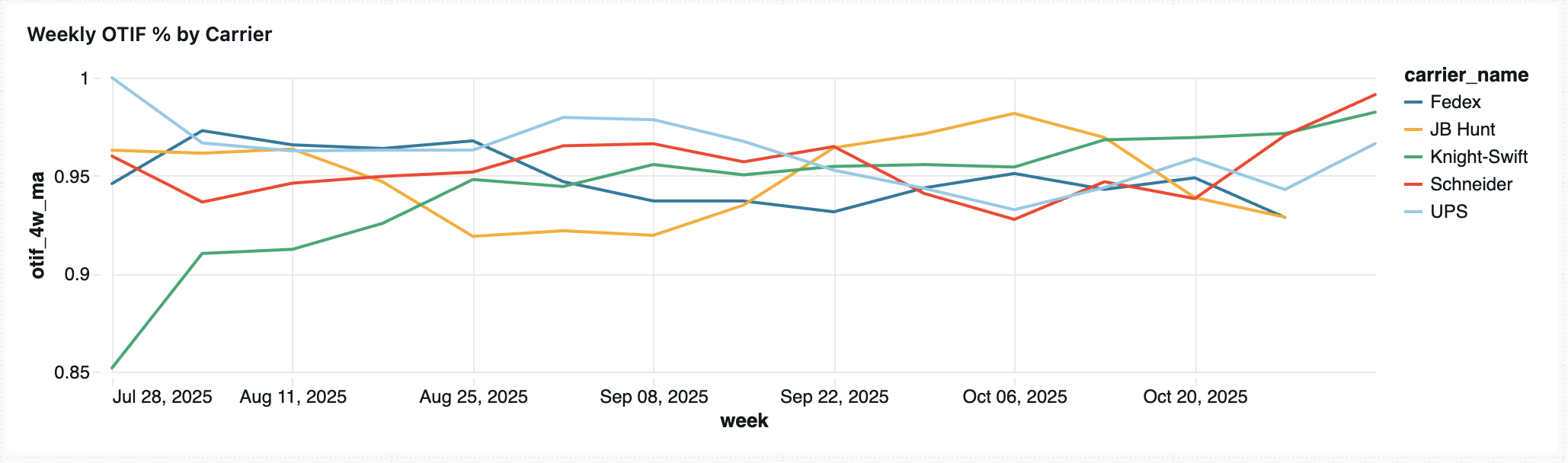
This gives us a "OTIF over time per carrier"-visualization as shown below.
Summary and Next Steps
In this article we built a management dashboard and reporting system on our data lakehouse for retail logistics.
While we've done some quality data engineering so far and dashboards are foundationally useful in retail, we haven't jumped into the generative AI game just yet.
That changes now.
In the next two articles, we continue to climb the generative AI ladder building first a conversational user interface over our metric views, and then building a decision intelligence agent to help analyze metric view trends with Agent Bricks.
Next in Series
Building a Retail Analytics Conversational UX with Databricks Genie
Databricks Genie transforms the Lakehouse into a conversational analytics layer—allowing retail leaders to ask natural-language questions about key KPIs like OTIF or stockout exposure and get consistent, real-time answers grounded in governed data from Unity Catalog.
Read next article in series