First Notice of Loss Analysis with Power BI in Property Insurance
Is your claims team still relying on manual data organization and cumbersome spreadsheets instead of clear, actionable data? Imagine it's peak storm season. Claims flood your desk, and critical insights are buried deep inside your "First Notice of Loss" (FNOL) data, insights that help you spot fraud patterns, optimize claims handling, and enhance underwriting, all without needing a PhD in analytics. Power BI gives you that clarity and brings those metrics to the surface.
This guide walks you through how to use Power BI with incoming bordereaux claims data, similar to what insurers might receive from a broker or TPA to uncover trends, reduce manual effort, and drive smarter decisions across your insurance operations.
After reading, you'll be able to:
- Quickly visualize trends in FNOL data
- Spot seasonal spikes or patterns that may warrant deeper investigation
- Save hours spent digging through spreadsheets
- Make more confident, data-driven underwriting decisions
FNOL data doesn’t just mark the beginning of a claim, it serves as a prominent indicator for operational trends. By analyzing FNOL activity over time, insurers can better anticipate resource needs, forecast seasonal claim volume, and ensure adequate reserves are in place to absorb peak losses. It also plays a vital role in the customer experience, offering the first opportunity to demonstrate responsiveness, build trust, and shape overall satisfaction.
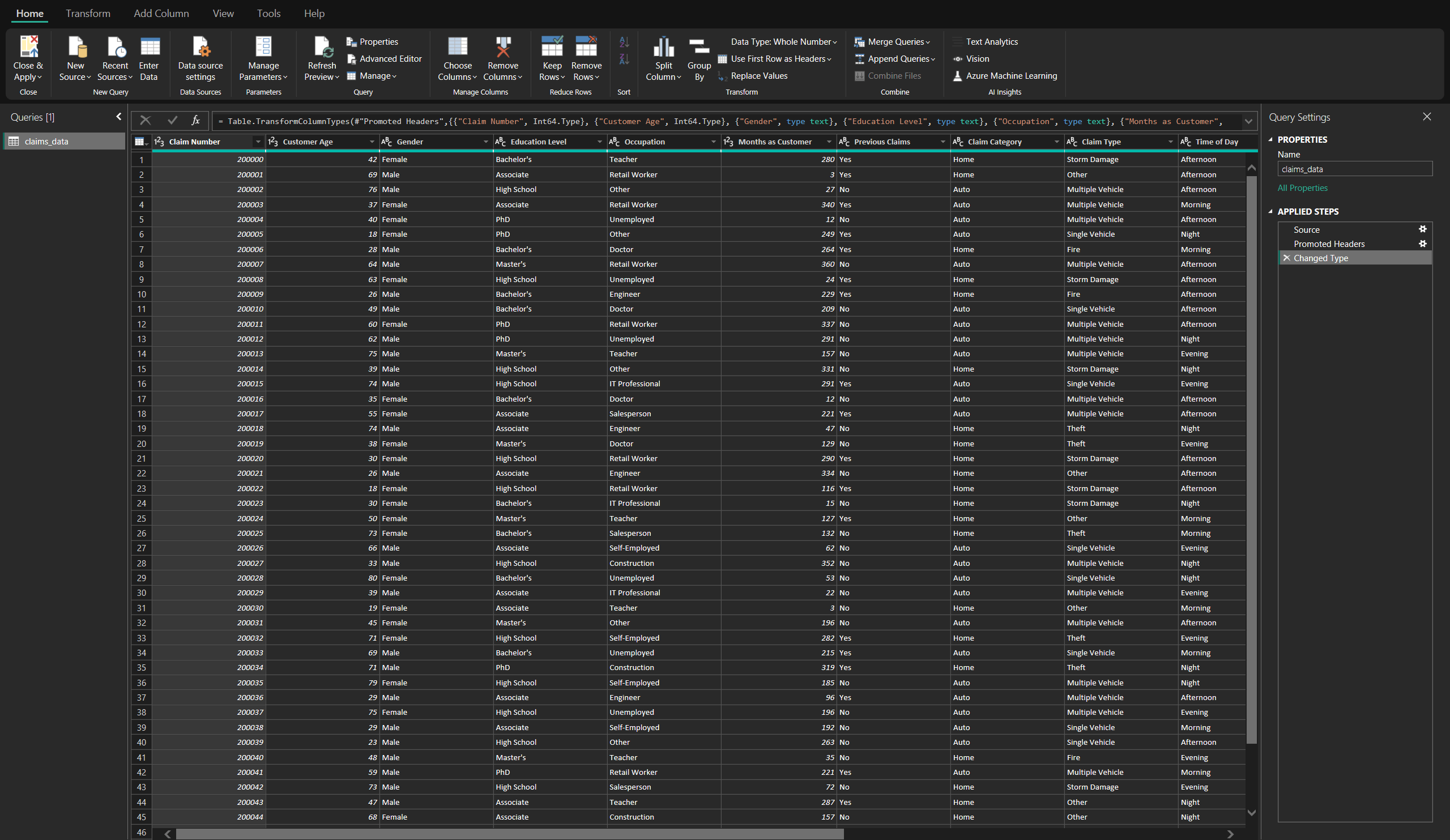
Setting Up the Data
Bordereaux reports are periodic claims summaries received from brokers or TPAs (third-party administrators). They're critical for tracking FNOL trends, claim types, and financial impacts.
Key fields in FNOL data include:
- FNOL Date – When the claim was first reported
- Claim Type – Fire, Theft, Storm, Auto, etc
- Claim Number – A unique identifier
- Claim Status – Open or Closed
- Policyholder Info – Customer attributes like tenure, location, etc
- Loss Amount & Deductibles – Key financials for decision-making
Each column in this dataset tells a story. FNOL Date marks when the policyholder first reached out. Claim Type gives us the nature of the incident, while Claim Status tells us whether it’s been resolved. Loss Amount and Deductible provide the cost picture.
By structuring this information properly up front (you can see an example in the image below), we make it easier to build charts, KPIs, and filters that actually deliver insight.
Loading the Data into Power BI
- Import the Dataset – Load the bordereaux data file into Power BI
- Verify Field Types – Confirm that dates are set as date types, and categories/numbers are properly formatted
- Create a YearMonth Column – Helpful for grouping claims chronologically
Use Power BI’s “Transform Data” pane to clean columns before building visuals.
Throughout this guide, we’ll refer to KPIs—Key Performance Indicators—which are high-level metrics that help insurance teams monitor performance and track outcomes.
Small details in data prep can make or break the visual layer. Power BI depends on structured input to render accurate charts. Grouping FNOL dates into a single YearMonth column gives a clean, intuitive way to analyze seasonality, especially when filtering by year or claim type.
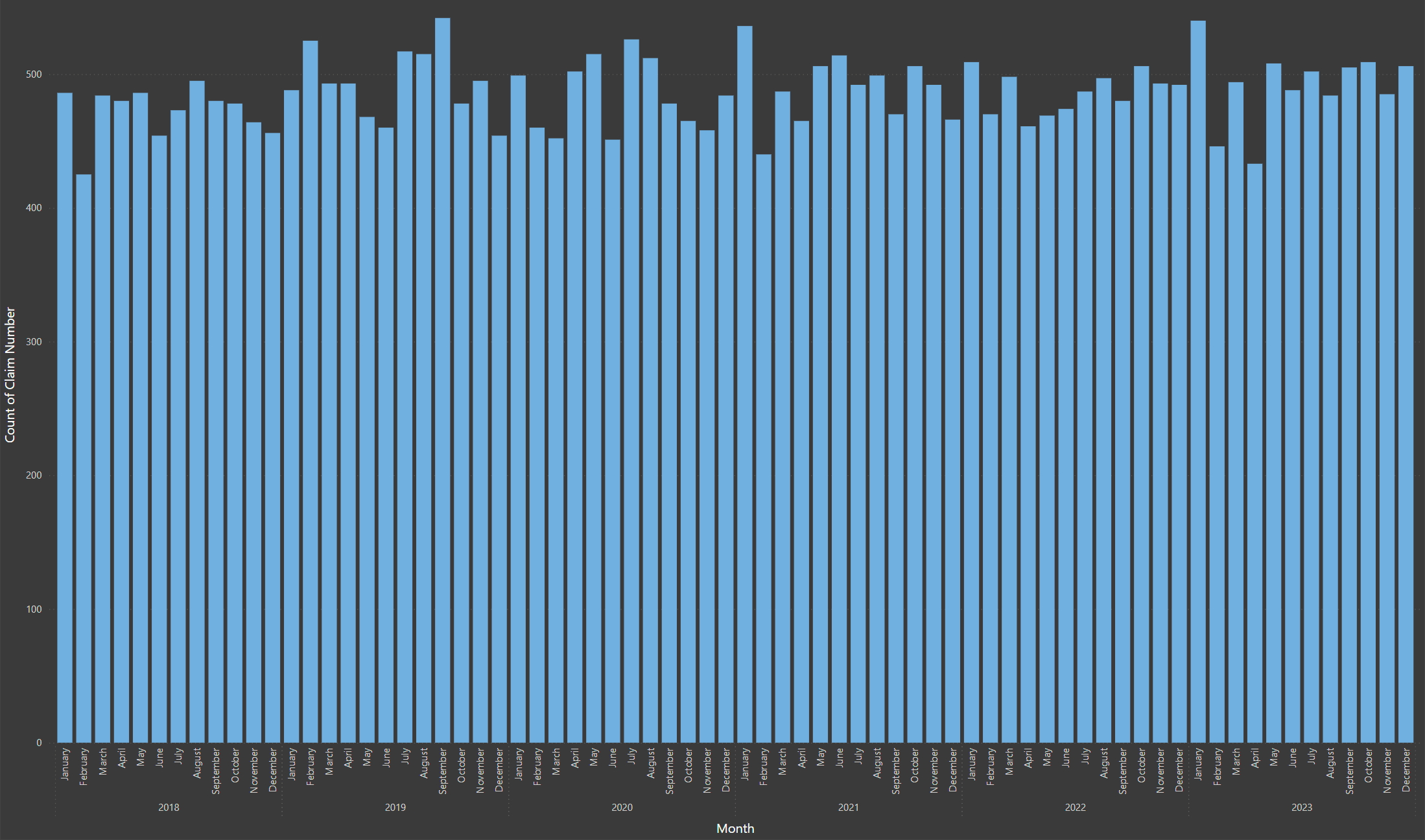
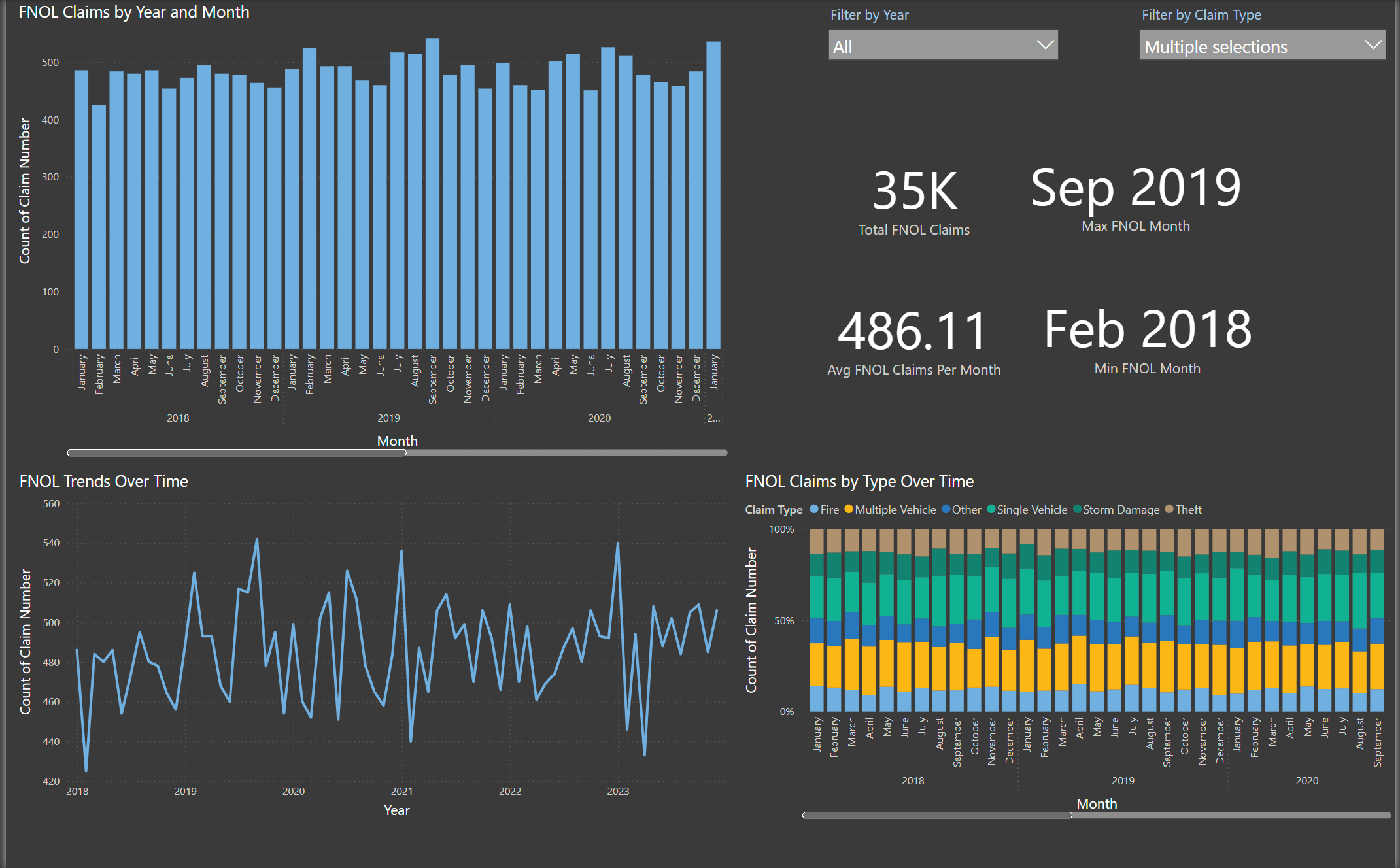
Creating Key FNOL Visuals
Now let's create a Bar Chart to represent FNOL Claims by Year and Month.
- Identifies seasonal patterns in claim volume
- Helpful for planning and resource allocation
- This visual is ideal for quickly spotting claim surges during high-risk months, such as hurricane or tornado seasons, helping you allocate adjusters or resources more efficiently
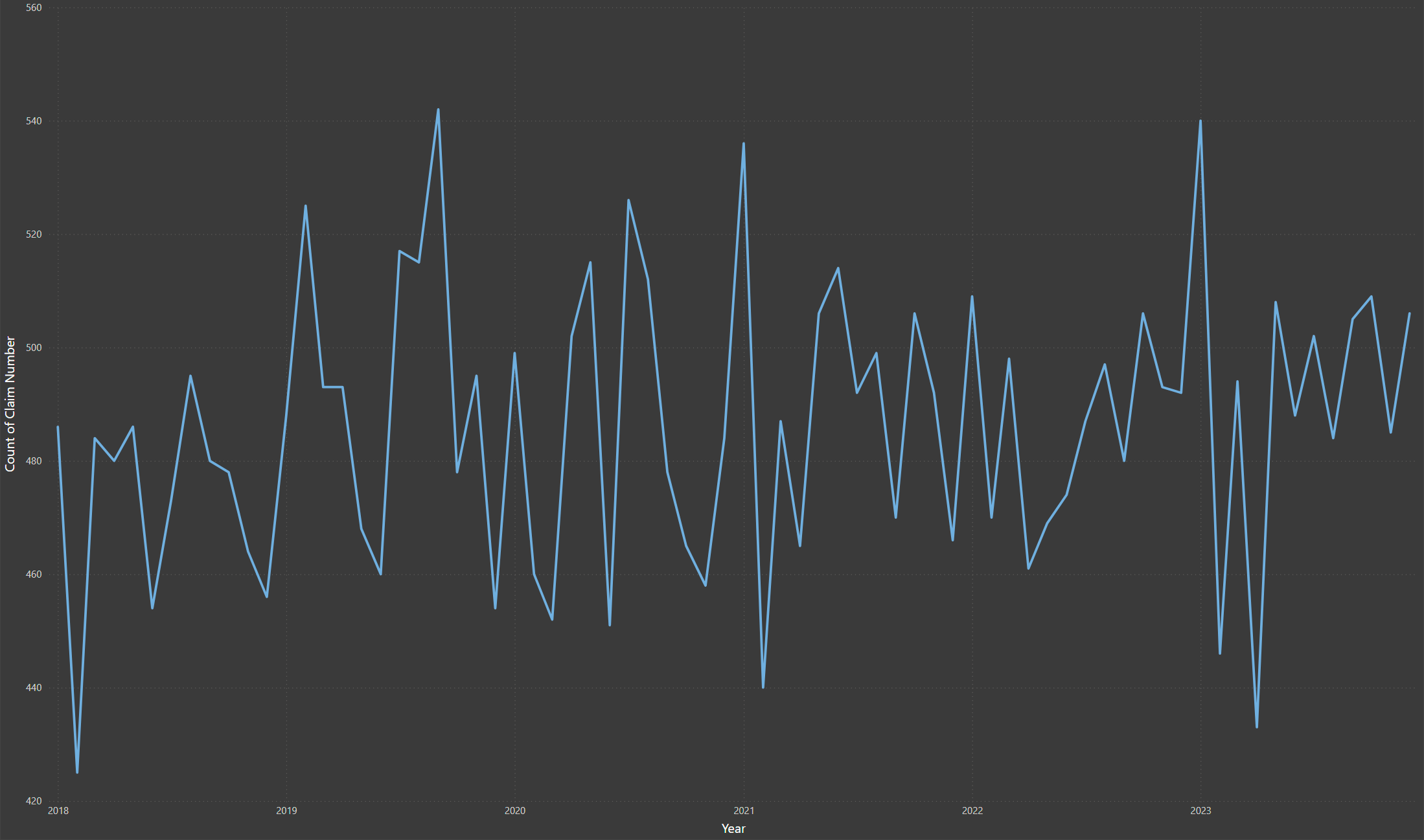
Line Chart: FNOL Trends Over Time
Now let's create a line chart to represent FNOL trends over time in Power BI.
- Makes fluctuations in claims volume easier to detect
- Can reveal unusual spikes that may indicate fraud
- Ideal for executives and analysts monitoring the impact of weather or operational changes
Unlike aggregated bar charts, line charts emphasize the volatility of claims over time. Sudden jumps or dips may correspond to large-scale weather events or system changes, offering a fast way to spot abnormalities. For instance, a sudden spike in a specific month could point to fraud clusters or gaps in coverage.
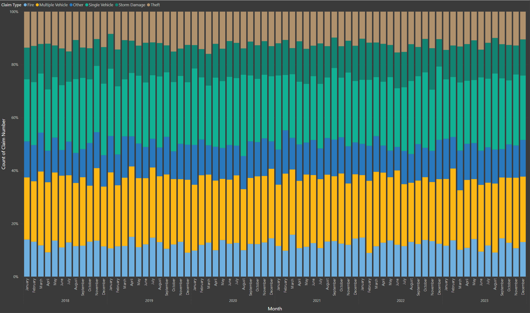
Stacked Bar Chart: FNOL Claims by Type Over Time
Now let's create a stacked bar chart to represent FNOL trends over time in Power BI.
- Breaks down FNOL by cause: Fire, Theft, Storm, Auto, etc.
- Great for seeing distribution and shifts across categories
- Helps surface claims types that are over- or under-represented over time
By visualizing the proportion of each claim type over time, this chart supports strategic decision-making. It helps leaders understand shifts in portfolio risk, uncover long-term patterns, and determine if a spike in one claim category is part of a trend or an isolated event.
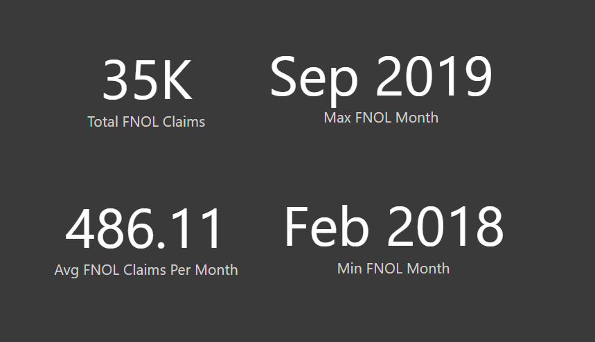
KPI Cards for Quick Insights
Now let's create a line chart to represent FNOL trends over time in Power BI.
- Total FNOL Claims
- Avg FNOL Claims Per Month
- Max FNOL Month
- Min FNOL Month
KPI cards are often the first place decision-makers look. They set the narrative for the report: Is the claim volume trending higher than expected? Are there particular months we need to watch? With just a glance, you can spot potential anomalies and prioritize further exploration.
Adding Interactivity with Slicers
To enhance data interactivity and support strategic decision-making, two slicers have been incorporated into the Power BI dashboard. The Year Slicer enables users to filter data by calendar year, facilitating clear year-over-year comparisons. The Claim Type Slicer allows segmentation by FNOL category, offering focused insights into specific claim areas such as auto and property. These interactive elements empower users to explore trends dynamically and tailor analysis to business priorities.
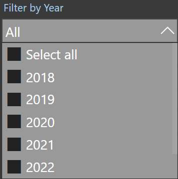
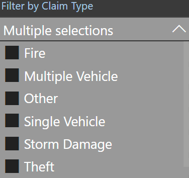
Keep slicers aligned horizontally at the top of the dashboard for easier access
Finalizing the Report for Clarity
To ensure clarity and professionalism in the final Power BI report, a neutral, industry-appropriate color palette and consistent, readable fonts have been applied. The layout is optimized for executive viewing, with key KPIs positioned prominently at the top and visualizations grouped logically—time-based trends displayed together and category-based charts organized accordingly. To support swift, data-driven action, the report highlights critical trends and visually emphasizes notable fluctuations, such as monthly spikes or drops.
Whether the reader is a claims adjuster, analyst, or executive, a clear visual structure makes insights easier to digest. The best reports use design not as decoration, but as a way to prioritize clarity, flow, and real-time decision-making.
Conclusion & Key Takeaways
Every FNOL record is an opportunity to learn. With the right visuals, what used to be buried in rows of spreadsheets becomes instantly accessible and meaningful. The more your team can interact with the data, the faster you can respond to seasonal trends, detect anomalies, and improve your claims process over time.
By connecting these data points through tools like Power BI, insurers gain a clearer view of operational efficiency, customer behavior, and risk exposure—all while streamlining workflows and reducing decision lag.
Why This Matters
- Better Claims Management – See volume, cause, and trends at a glance
- Fraud Detection – Spot sudden jumps in a certain claim type
- Underwriting Confidence – Use trends to justify pricing, policy updates, and risk segmentation